Discovering APL « Why Vectors? « A Shocking Brevity « Some APL Examples «
APL and Typography
All writing systems and notations are bound closely to inscribing technologies. For example, the glyphs of the earliest Greek and Viking alphabets were formed by the straight strokes of chisels. The curves and serifs of the Latin majuscule, for which Trajan’s Column provides the paradigm, reflect a more advanced sculpting technique.
Each advance in inscribing technology first mimics and then adapts the glyphs it inherits. The writers of the mediæval and Renaissance churches started with letter forms designed for chisels, then adapted them to suit their faster pens. Thus in York Minster, the monk Alcuin devised what became the Carolingian miniscule, and Italy saw the creation of chancery cursive. When Gutenberg built a press such as Marco Polo had seen in China, his type was a simple copy of contemporary written pen forms. Later in Italy, printers thinned and lightened the black-letter forms to the light and elegant types of the Aldine Press.
The APLs are part of this story.
Strictly Linear
An IBM group implemented as a programming language the mathematical notation Ken Iverson described in A Programming Language.
In that book, Iverson set out to revise and simplify traditional notation, which had evolved over the centuries as one mathematician after another improvised whatever seemed convenient to capture each new idea. They were constrained only by the limits of a pencil on a plane. Mathematicians invented, and printers followed patiently.
|
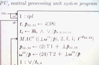
When Iverson, Falkoff and others first came to implement APL, Iverson’s notation was adapted to the strictly linear inscription of teletype terminals. But the interchangeable ‘golfball’ printing head of IBM typewriters and terminals (and later the Xerox ‘daisywheel’) made it possible to produce a linearised version of the glyphs used in the book.
Computing in the 1980s was dominated by the spread of cheap PCs with only ASCII Latin characters. Specialised mainframe APL terminals became a relatively expensive way to write programs. Although the Macintosh and its variable fonts appeared in 1985, it was not until late in the decade that an APL was available for it. On Macintosh and PC alike, writers of APL had to learn non-standard keyboard mappings to create their characters.
By 1990 several APLs had adapted their notation to the dominant inscribing technology. Niall used reserved English words; J paired ASCII characters to make 2-character glyphs; A+, J and K (and now Q) all exploit characters usually associated with punctuation.
Write On
As the inscribing technology changes, so do the writing habits. The spread of the simple typewriter made the use of ligatures, even in printed books, seem pedantic and antiquated. Æsthetics became aesthetics and to write mediæval came to seem, well, mediaeval. To write cafe instead of café became if not actually correct, at least forgiveable. A generation grew up to drink caffè latte without being able to type it.
The wheel continues to turn. The Internet has spread and connected PCs across many linguistic systems and scripts. Operating systems now routinely support not just multiple fonts but multiple writing systems and keyboard mappings to use them. The PC on which I am writing this has its browsers configured to display HTML pages in Western European languages, in Turkish, Japanese and Korean.
After its initial fascination with graphic design, web design now looks more like typography. My mouse rests upon a mousemat that shows me how to key the extended Western Latin ASCII characters less easily reached from the keyboard. (Or see Bringhurst’s ingenious mapping in The Elements of Typographic Style.) My girlfriend manages to use Macintosh and Windows mappings for Japanese without a diagram. I can usually manage the same for APL, but have a diagram above my monitor for when I can’t.
Signs of the times
Contemporary inscribing technology supports multiple languages and writing systems. (A Japanese web page will casually mix three to five different scripts.) The elegant and distinctive glyphs of APL are by no means the most exotic writing system my PC supports today.
Iverson insisted upon the importance of his notation as a tool of thought. Similarly, Paul Graham has written of coding as an essential part of exploration and design. The terse and distinctive signs of APL increase its utility, but only if they can be typed as well as written.
Recent technology made APL’s glyphs relatively inaccessible, and correspondingly less useful as a tool of thought. Current technology makes them once again accessible, and more useful than they have been for decades.
Further Reading
An Essay on Typography Eric Gill, 1931, 5th edn 1988 Lund Humphries, London, ISBN 0 85331 509 4
The Elements of Typographic Style Robert Bringhurst, Version 2.5, 2002, Hartley & Marks, Vancouver BC, Canada. ISBN 0 88179 132 6
The Solid Form of Language Robert Bringhurst, 2004, Gaspereau Press, Kentsville NS, Canada. ISBN 1 894031 88 1 · Reviewed in Vector 21.2 “Liquid Mathematics”
 APL Wiki
 A fragment of the description of SYSTEM/360